Astro needs no introduction here in Malaysia. Almost everyone has heard of it, let alone subscribes to it at home. Although it is such a household name and a large corporation, has anyone ever looked at their website?
Everything looks all over the place, and navigation bar seriously needs some total makeover. My team and I had the opportunity to experience pitching my design concept to the client, but after 2 rounds of pitching, nothing major was done to the iconic brand’s website.
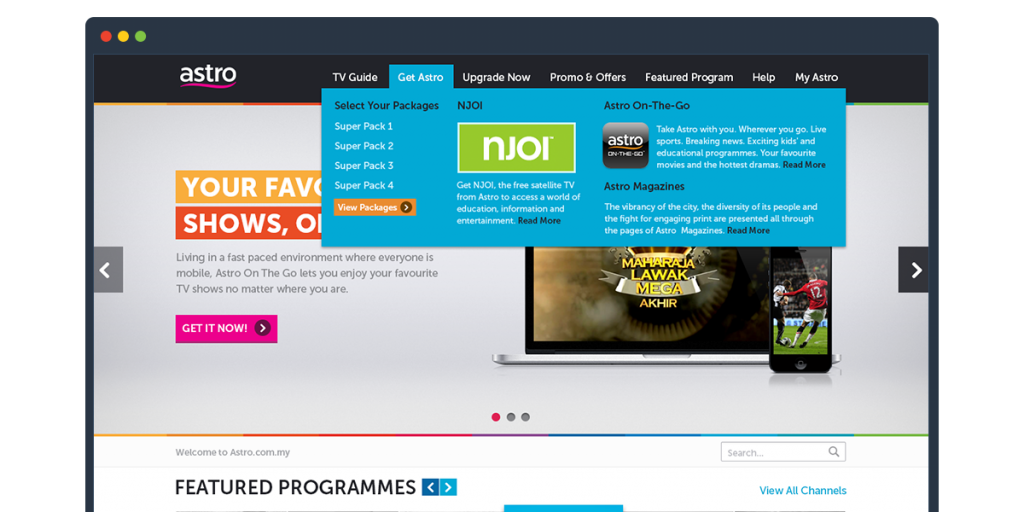
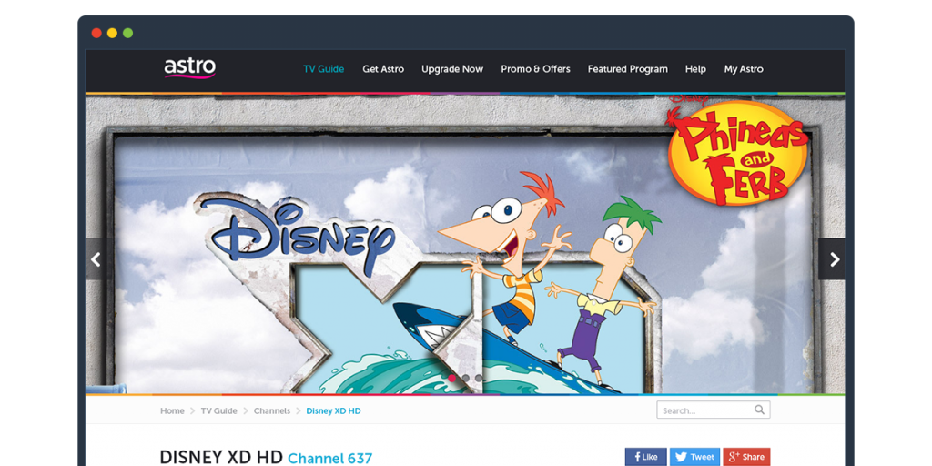
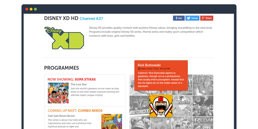
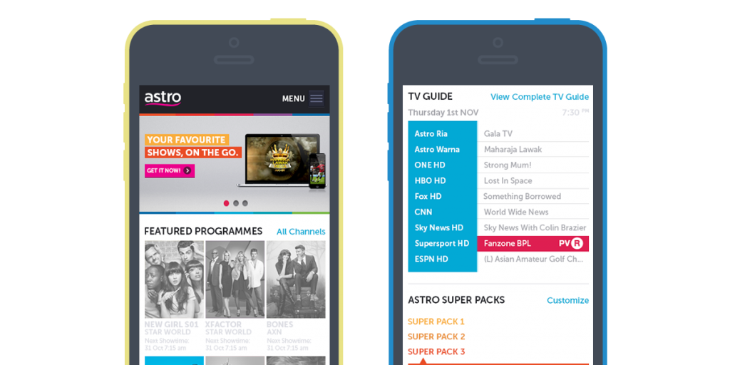
The design approach I underwent was to clearly emphasize the navigation bar and since it was a really content rich portal, breadcrumbs was added onto the underlying pages so that users would not get tangled up and lost wherever they may land. I also chose a more minimalistic and cleaner UI and focused heavily on introducing the rainbow spectrum that was a part of Astro’s corporate identity.
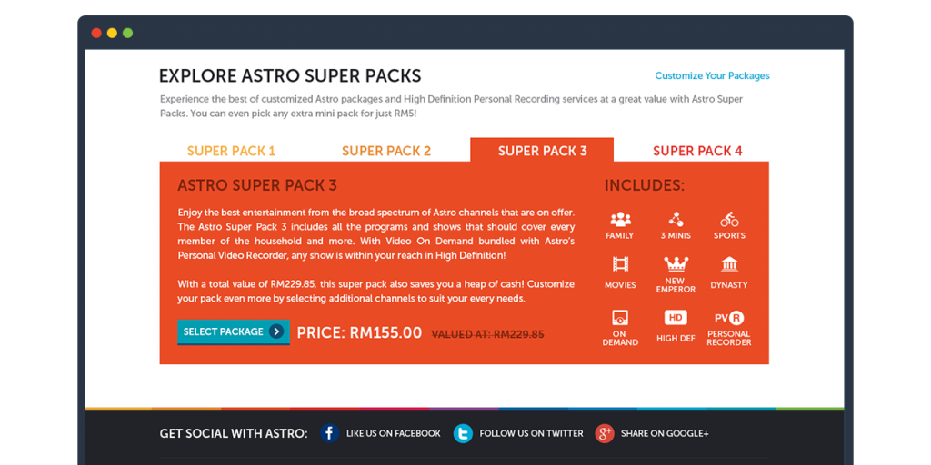
The idea of the design was to lead existing customers and potentially new customers to upgrade from their current packages and also convert the new customers into subscribing to Astro. So ultimately the design was focused to drive the sales, which we thought was one of the key objectives of the new design.
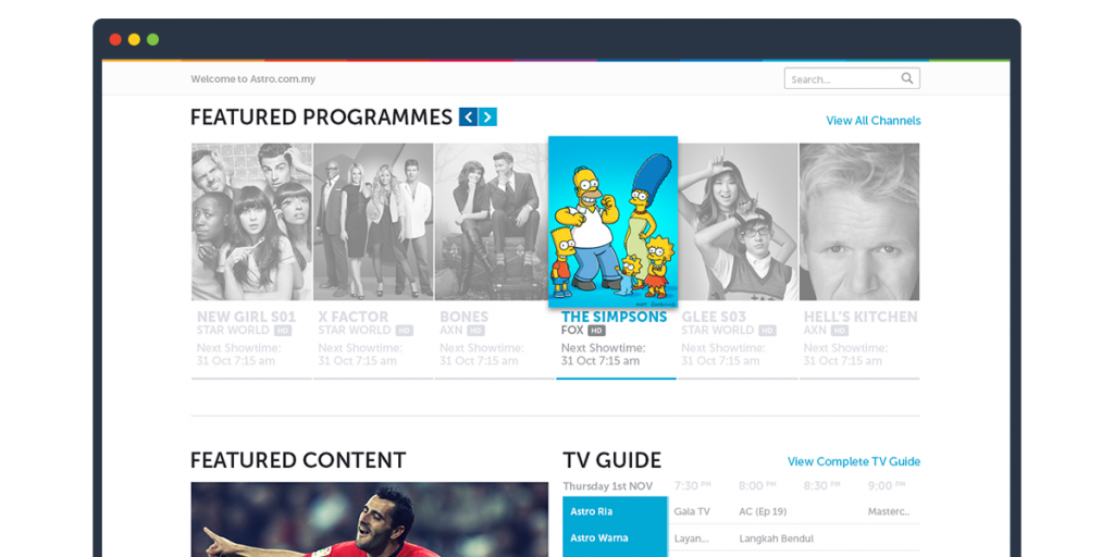
The secondary objective was to highlight any upcoming and new tv shows/series and promoting exciting contents and promotions.