Case Study

Case Study

Boosting Mobile User Adoption by 300% Through Improved App Experience

Boosting Mobile User Adoption by 300% Through Improved App Experience

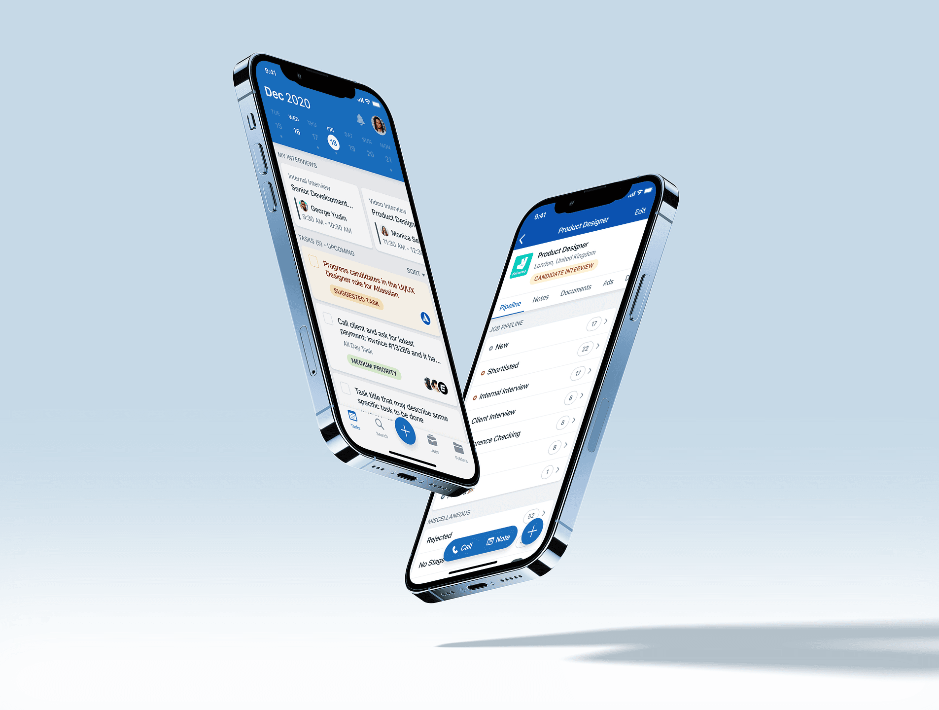
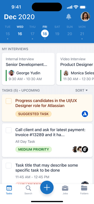
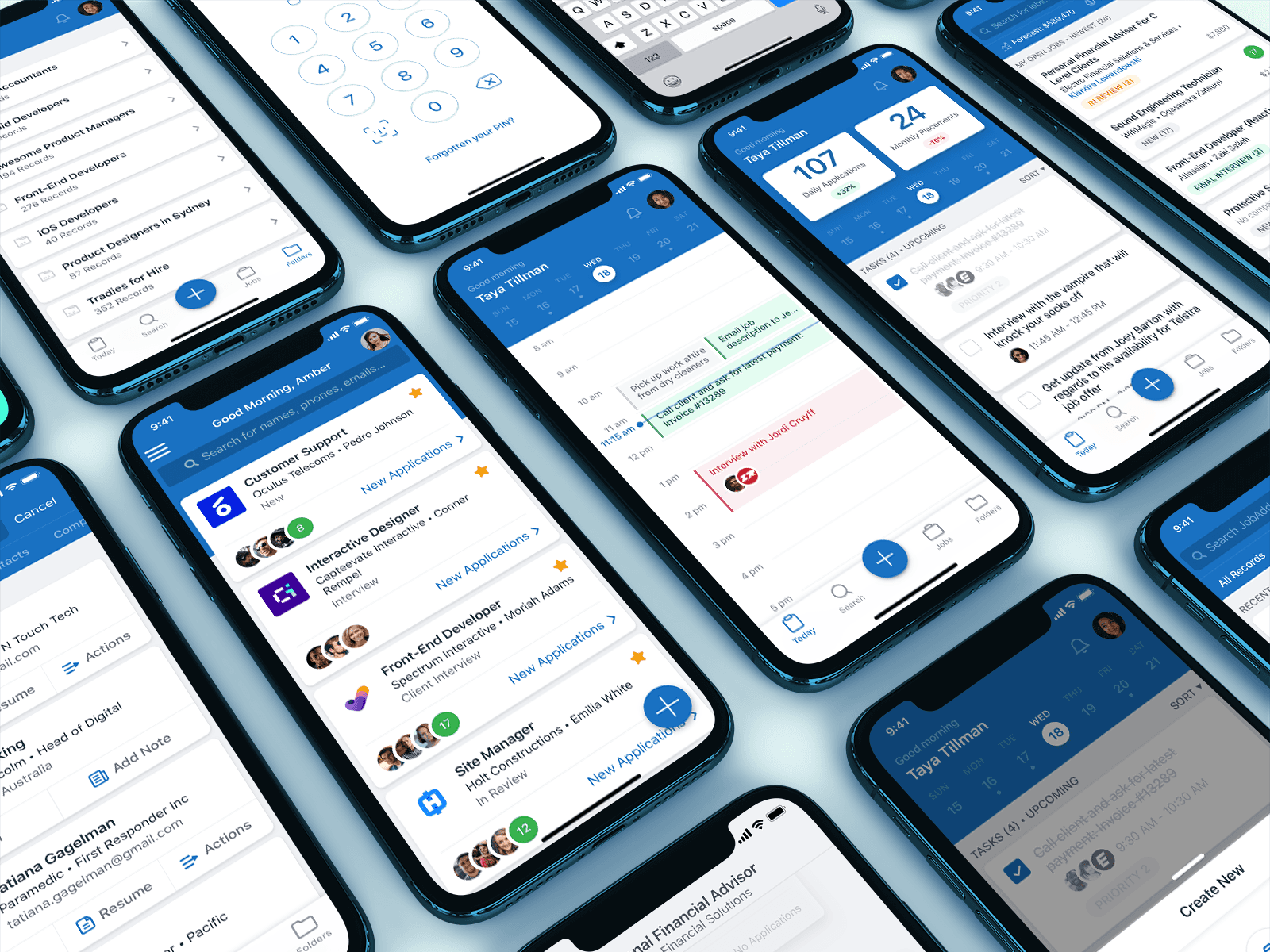
A collection of JobAdder mobile app designs

Overview

JobAdder is a global, cloud-based recruitment management platform that simplifies the hiring process, making it more efficient and productive for recruiters and hiring managers.

As the sole Product Designer for the mobile team, I led the effort to enhance the app's user experience through user research, usability testing, and rapid prototyping. Working closely with the product manager and mobile engineers, we rolled out incremental updates that significantly improved the app's usability, navigation, and feature set.

By conducting extensive research and redesigning key aspects of the mobile app, we increased the mobile user base from 4,000 to 12,000 users at its peak before COVID, with nearly 60% of users active on a monthly basis.

My Role

Mobile Product Designer -> Product design, User research & testing, Interactive prototyping

Research methods

Competitor analysis, survey, interviews, usability testing, affinity mapping

Team

Kim Boutard (PM), David Dancy & Paul Breckon (Mobile engineers)

Outcomes

Increased User Adoption

Increased mobile user adoption from 4,000 to 12,000 users

Boosting Engagement

Monthly active users (MAU) increased from 30% to 60%

Enhanced Consistency

Improved navigation and user experience to be consistent

The Challenge

When I joined JobAdder in October 2017, the mobile app was in need of a comprehensive overhaul. The mobile experience was inconsistent and lacked many of the features found in the desktop version, leading to user frustration and disengagement. Key problems included:
- Inconsistent UX: The app's user experience was fragmented and not aligned with the desktop version, confusing users.
- Feature Gaps: Users were unhappy with the lack of critical features present in the desktop app but missing from mobile.
- Messy Navigation: The navigation structure was unclear, often leading users into dead-end loops.
- Undefined User Journeys: Certain workflows had no clear user path, leaving users lost in the app.

These issues led to user dissatisfaction and a stagnant user base. The goal was to create a consistent, intuitive mobile experience that mirrored the desktop app's strengths while optimising for the needs of mobile users.

Discovery & Research

Surveys

To gather quantitative data, we created surveys using Typeform to collect insights into user behaviour and preferences. These surveys helped us understand what users valued most about the product and highlighted areas needing improvement. This data informed our roadmap, allowing us to focus on features that would make the biggest impact.

User Interviews

To deepen our understanding of user motivations and needs, we conducted user interviews via Zoom. These conversations gave us personal insights into how users interacted with the app, revealing pain points and opportunities that weren't obvious in the data alone. Users expressed frustration with the lack of feature parity with the desktop app, but also appreciated the app's potential for on-the-go productivity.

Design & Iteration

With insights from surveys, interviews, and usability testing, I led the design of a more user-friendly mobile experience. I worked closely with mobile engineers to ensure the design was technically feasible and aligned with the app’s architecture. We focused on improving navigation, refining user flows, and prioritising high-impact features that would resonate with users.

Usability Testing

We conducted usability testing on the existing app, focusing on understanding how users navigated and interacted with key features. This testing helped identify specific pain points, such as confusion in navigation and the lack of clear user paths in certain journeys. These insights guided the redesign, helping us streamline the navigation and create a more intuitive experience.

Reflection & Learnings

Designing for a complex, feature-rich platform like JobAdder’s mobile app required balancing user needs with technical constraints and business priorities. One of the biggest learnings was the importance of focusing on “quick wins”, features and improvements that could provide immediate value to users, without the need to replicate the entire desktop experience.

Additionally, this project reinforced the value of close collaboration between product designers, engineers, product managers, and other stakeholders. By involving the entire team in the design process from discovery to implementation, we were able to ensure that each feature aligned with user needs while also being technically feasible.

Made With ❤️ Love

Made With ❤️ Love

Made With ❤️ Love

Let's Connect

Looking for a product designer who excels at crafting intuitive user experiences and turning ideas into reality? Let’s connect! Reach out on my socials to start the conversation.

Let's Connect

Looking for a product designer who excels at crafting intuitive user experiences and turning ideas into reality? Let’s connect! Reach out on my socials to start the conversation.

Let's Connect

Looking for a product designer who excels at crafting intuitive user experiences and turning ideas into reality? Let’s connect! Reach out on my socials to start the conversation.